What I learned from color-drenching
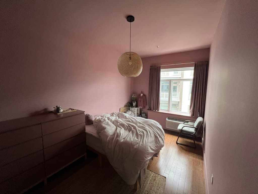
Last December, I painted every inch of the bedroom's walls in a mauve-y pink color called Cherry Malt. (I'll note that I did it because I wanted to visually warm up the neglected space, and this was before the internet exploded with color-drenching as a trend.) However…I’m about to undo it.
Did I just waste two gallons of paint? No, I wouldn’t call it wasted when I’ve thoroughly enjoyed the color. It made the room feel drastically better than the greige that was on the walls before. So why am I undoing it? Well, here's what I’ve learned from this project:
1. Sheen
Trim needs to be in a higher sheen.
An experienced interior designer I follow on Youtube convinced me that it’s okay (and maybe even better) to paint trim (in my case, baseboards and door framing) with the same flat paint that is used on the walls. I didn't want to spend money on a separate can of paint for the little trim that I had, so I followed that designer's advice and painted everything in matte.
It looks awful. As soon as it dried, I told myself that I need to repaint all the trim in semi-gloss. The matte finish makes everything look less dimensional and for some reason, unnatural. I don't know if it’s only because I have semi-gloss trim everywhere else in the apartment, so it looks off, or if it’s because of the color not being a neutral, but it just isn't good. If you are color-drenching, don’t be cheap like me and get a can of a higher sheen for the trim.
2. Dimension
Moulding is essential.
Our condo apartment has a fairly modern style—and I like modern, to a certain extent. Our walls are completely flat with no texture. There is no crown moulding, wainscoting, chair moulding, or anything of the sort. Our baseboards are also completely flat. There aren't even protruding corners—the bedroom is a completely flat box.
When a box is painted, it is still a box.
Take a look at these inspiration images I saved before painting:
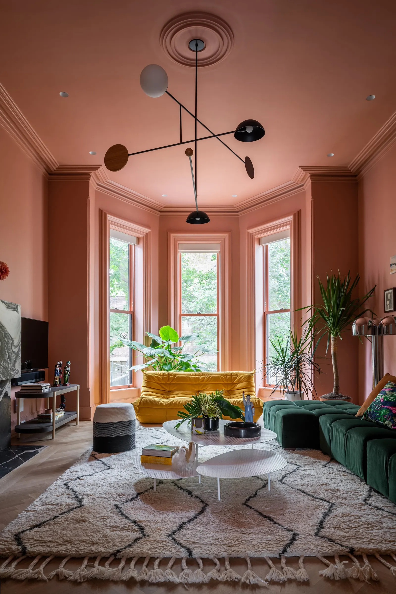

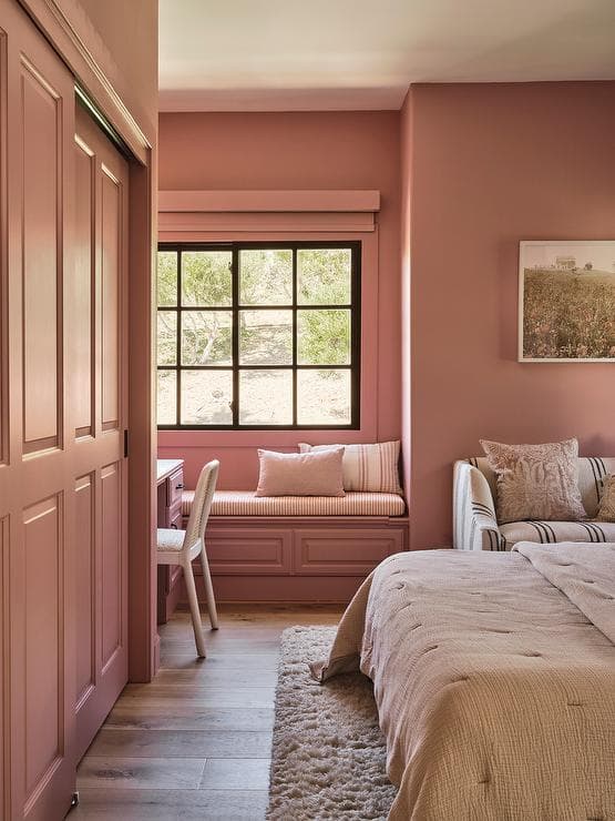
I didn’t realize it at the time, but the reason these rooms look so good is because of all the dimensional doors and walls.
In the first picture, there is crown moulding. There are intricate details on the window trim, as well as the baseboard trim. And there is a ceiling medallion around the light fixture.
In the second picture, there is, again, crown moulding—this time more decorative than the first. There is wainscoting on the wall. There is wainscoting on every cabinet door.
In the third picture, there is no crown moulding, but there is a corner protruding in the room. There are built-ins with shaker details that add dimension. There are several layers to the closet door frame.
Now imagine all that detail was removed, and all those surfaces are just…flat. The appeal would not be the same.
3. Color
Choose the color carefully.
Every interior design source on the internet will tell you to get samples, put them on the wall, see them in different lighting, etc., so I will not repeat the basics. Personally I made some mistakes there, but what the internet doesn't mention is this:
The whole room will have to commit to coordinating with that color.
I thought it was a good idea to start with the color of the room, and then choose everything else to coordinate with it. But then I realized how bold and full of personality the Cherry Malt color was, and how it limited my choices of everything else.
Maybe a neutral color-drenching color makes this point moot. But for me, I realized that some colors of things that I normally love, don’t do well reflecting off of Cherry Malt. I also realized that the choices I was making for the rest of the room became less versatile, and I wanted pieces that would work in multiple settings (especially knowing that we won't stay in this apartment forever). I had bought a set of matching curtains for the room, but realized I would never be able to use those same curtains anywhere else, unlike my white or gray curtains that I've moved with me from place to place.
Take a look at my inspiration pictures above again—everything has been designed to coordinate. The rooms would lose their personalities completely if the wall was a shade of white or off-white.
Test the color choice from outside the room.
In the winter, when I painted the room, I kept the bedroom door closed at all times (to only heat one room at a time, saving on electricity bills). In the summer, I tend to keep the door open. It was then that I realized, the pink looked different from outside the room, and next to my bluish-gray cabinet, it didn’t look right.
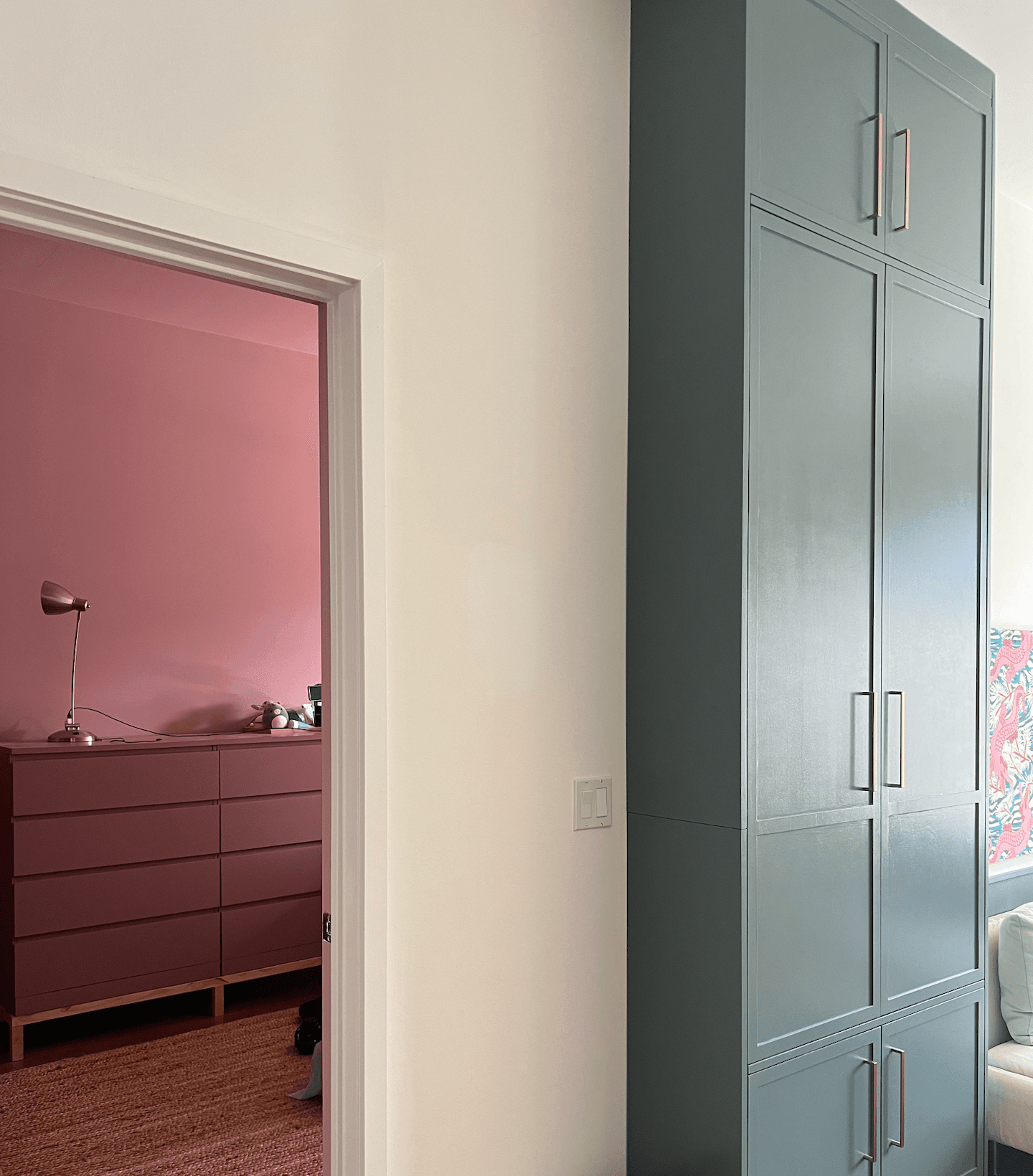
Actually, let's be more specific. The color itself looks great next to my bluish-gray cabinet. In fact, I have a similar pink in the artwork that hangs next to that cabinet. But the ratio of color is wrong. I want the bedroom to feel second in hierarchy to the living room, but somehow, with this color combination, the bedroom is competing for focus too much. And you can see, it looks like a different pink from this angle compared to the picture from inside the room (at the top of this post).
This is ultimately the reason that I am undoing the pink paint. Both my husband and my friend say they don't see the problem, so maybe I am crazy. But the lesson here is to test the color from outside the room (and maybe a large swatch, to get a sense of ratio).
What now?
I’ve decided to paint the walls white for now, and to work on projects in the rest of the room. Then maybe if it feels right, I’ll color-drench again (though definitely not the same shade of pink) and maybe add some moulding. Or maybe only parts of the room will be painted. Or maybe it'll be a classic white. We will see where things take me.
Published Oct 2024
Scroll to top ↑